iPhone 15 Pro Max screenshot tutorial, step by step
1290 × 2796. Twenty
minutes from blank to App Store-ready. For iPhone 16 Pro Max submissions (Apple's 6.9" class at
1320 × 2868), follow the same workflow with the 6.9" export size — proportions are
close enough to 15 Pro Max that designs translate directly.
This is a hands-on tutorial. You'll need a screenshot from your iOS app (any resolution — we'll re-render at the right dimension on export) and a few minutes. No design background required.
Update: iPhone 16 Pro Max is now available
Screenshotify now ships a photo-realistic 3D iPhone 16 Pro Max frame (GLB model, WebGL-rendered).
The steps in this tutorial apply directly — just pick iPhone 16 Pro Max from
the device dropdown instead of iPhone 15 Pro Max. The App Store 6.9" export class
(1320 × 2868) is unchanged; your submission workflow stays the same.
See the iPhone 16 Pro Max mockup generator
for specs and a dedicated how-to.
Step 1: Open the editor
Go to screenshotify.app/app. The editor opens with one empty panel containing one device frame. No signup needed for this step (or any of the design steps — only export requires Pro).
Step 2: Pick iPhone 15 Pro Max as the device
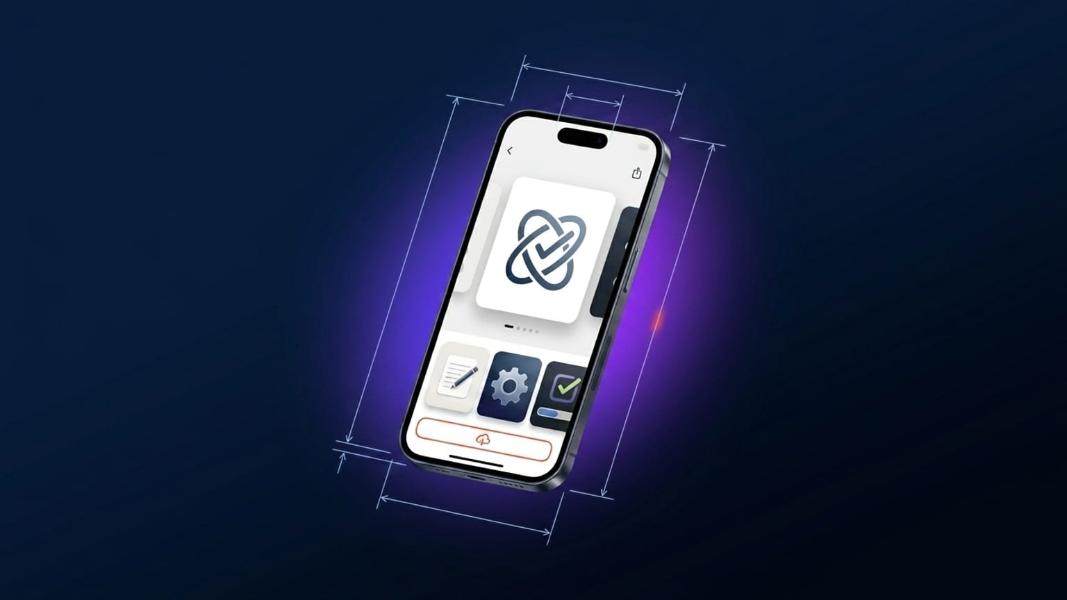
Click the device frame to select it. In the right-hand properties panel find the device-picker dropdown. It defaults to Auto (which follows your export-size selection). For this tutorial pin it explicitly: pick "iPhone 15 Pro Max" from the list.
The device renders with accurate body proportions derived from the real iPhone 15 Pro Max dimensions (159.9 × 76.7 mm, body ratio 2.085). The Dynamic Island and bezels match the real device.
Step 3: Drop your screenshot
Three ways:
- Drag and drop a PNG from your desktop onto the device frame.
- Pair your phone via "Connect phone" in the header. Scan the QR, pick photos on the phone, they transfer over WebRTC directly.
- Upload manually via the device's properties panel — the "Upload screenshot" button.
The screenshot auto-fits inside the device frame regardless of source resolution. If it's smaller than 1290 × 2796, it'll get upscaled and the export may look slightly blurry — capture at native iPhone resolution where possible.
Step 4: Add a caption
Click "Text" in the left-hand Add panel. A new text layer drops onto the canvas. Drag it to the top of the panel (the top quarter is the eye-landing zone in carousel-thumbnail renders). Click the text to edit; the properties panel shows font, size, color, weight, alignment.
Caption rules that work:
- 6-9 words
- Verb-first ("Track every meal", not "An easy way to track meals")
- One claim per panel
- Font weight 700-900 (Inter Bold or heavier reads at thumbnail)
- Font size around 80-120 px at native resolution (renders to ~20 px in carousel thumbnail — readable)
Step 5: Pick a background
Open the Background section in the sidebar. Three options:
- Gradient preset — Indigo, Sunset, Ocean, Mint, Peach, Rose, etc. Quick start, all work fine.
- Custom gradient — pick from/to colors. For finance pick deep blue; health pick teal; entertainment pick warm magenta or orange.
- Solid color — minimal but valid.
If you're building a multi-panel carousel, keep the background global (one gradient flowing across all panels) rather than per-panel — that's the continuity pattern from the anatomy post.
Step 6: Tilt the device
Select the device frame. In the properties panel find "Tilt Y" and drag to about +12 (degrees). The device rotates around its vertical axis, giving a 3D-perspective look. The SVG-based renderer projects with proper depth-sorted side faces.
Pick one tilt direction and use the same value across all panels — not alternating.
Step 7: Add more panels
Click "+ Panel" below the carousel. Each new panel inherits the global background. Repeat steps 3-6 for each panel with a different screenshot and a different caption. Aim for 4-5 total panels.
For the second panel — usually the strongest visual in the carousel — pick the most compelling app feature you have. Drop-off in the App Store carousel is real; users often decide off the first two panels.
Step 8: Translate (if you ship in multiple markets)
Click the language picker in the header (flag dropdown). Check the locales you want to ship. Click "Translate all". Every text layer auto-translates into the enabled locales. Switch the active language to review each — edits stick per locale.
Translation is a Pro feature. The rest of the workflow is free.
Step 9: Export
Pro feature. Click "Export" in the header. Pick the size class:
- 6.7" class submissions:
1290 × 2796(iPhone 15 Pro Max native). - 6.9" class submissions (iPhone 16 Pro Max): pick the 6.9" export size — the same design re-renders at
1320 × 2868.
If you've enabled multiple locales, all of them export. Click "Download ZIP".
The ZIP contains [size]/[locale]/01-panel-name.png per panel. Drop those files into
App Store Connect → Screenshots per device class per locale.
What can go wrong
- Blurry export — your source screenshot is below the native dimension. Recapture at native iPhone resolution.
- Caption gets cut off — too long. Cut to under 10 words.
- Device looks weird at tilt — angle too steep (over 18°). Reduce to 10-15°.
- App Store Connect rejects upload — probably wrong dimensions. Cross-check the export class matches what App Store Connect requests. The size guide has the full reference.