· Research
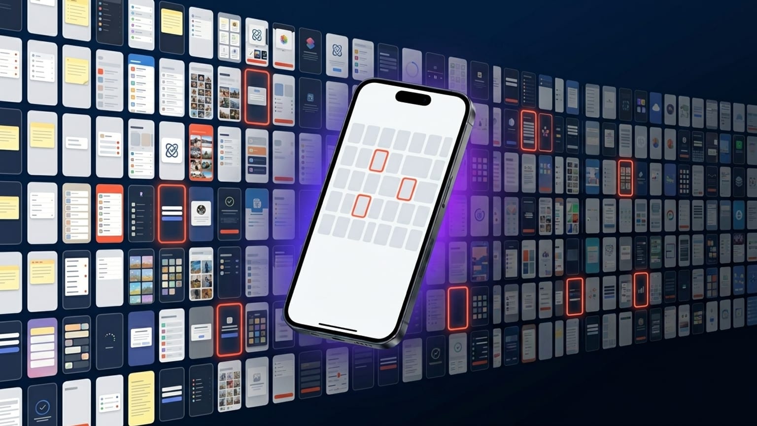
App Store screenshot statistics from the top 100 apps
What we measured across the top 100 App Store carousels — caption length, dominant colors, device-tilt direction, text placement.
Long-form posts on the design and conversion side of App Store carousels. Updated as we ship.
What we measured across the top 100 App Store carousels — caption length, dominant colors, device-tilt direction, text placement.
Honest take on which performs better, when, and why the answer is more nuanced than "dark mode always wins".
Caption-writing rules that hold up across categories — length, structure, verb choice, and the captions to avoid.
The practical workflow for shipping screenshots in every locale Apple accepts — what to automate, what to review by hand.
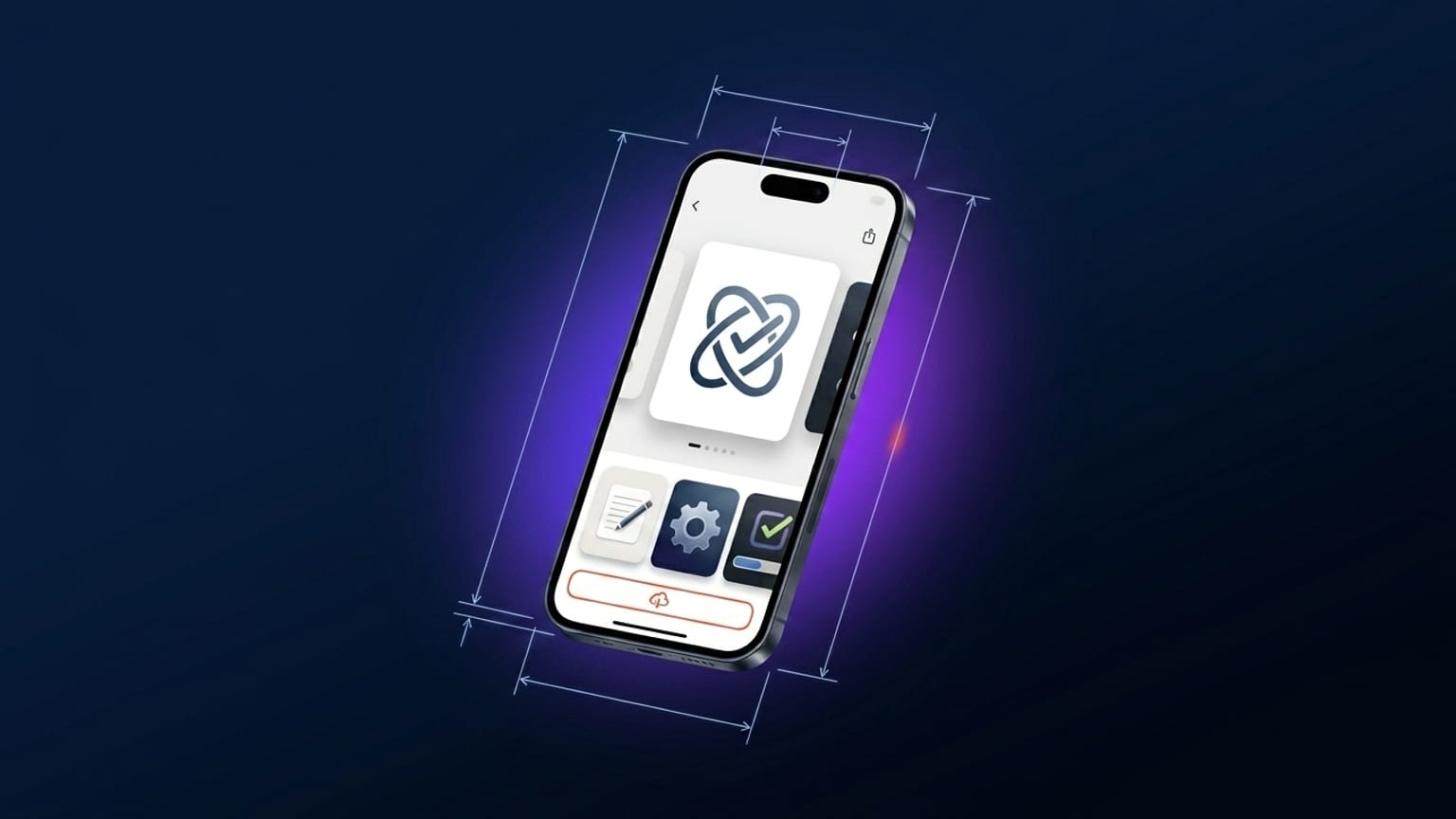
The structural design decisions in any high-performing carousel — caption position, device tilt, palette, continuity. With Headspace as a worked example.
A hands-on walk-through from blank canvas to App Store-ready 1290 × 2796 PNG, using Screenshotify. Plus what to do for iPhone 16 Pro Max submissions.
What works in the App Store carousel right now — patterns from top-100 apps, the formats Apple keeps pushing, and where conversion gains have moved since 2024.