Dark mode vs light mode App Store screenshots
The dark-mode-always-wins advice came from a real source: aggregated A/B test data from 2021-2023 floating around the ASO community (case studies from agencies like Phiture and AppTweak, plus indie-dev twitter threads). The directional consensus was that dark-background carousels outperformed light by a single-digit-to-low-teens percentage on tap-to-install, averaged across categories. Indie devs repeated the number, the advice calcified.
By 2025 the gap had mostly closed. By 2026, when you look at category-level data instead of aggregate, the picture changes again: dark wins big in some categories, loses in others, and is a coin flip in the middle.
Why the original data was misleading
The 2022-2023 tests aggregated across categories. The test pool skewed toward categories where dark is conventional anyway — games, music, photo/video, social. In those categories dark carousels perform better not because dark is universally better but because dark matches user expectation. A bright-pink games carousel would test worse not because it's light but because it breaks category convention.
When researchers ran the same tests in categories where light is conventional (productivity, education, kids apps), light won. The aggregated number was the average of two opposite effects, and someone reading the aggregated number assumed it generalized.
Category-by-category in 2026
Dark wins decisively in:
- Games — universally. The carousel is the trailer; dark sells immersion.
- Music / podcast apps — Spotify-conditioned palette expectations.
- Photo/video editors — pro-tool signaling; the dark UI is the brand.
- AI chatbots — dark with neon or warm accents reads as "advanced tech".
Light wins in:
- Productivity / note-taking — Notion, Linear, Things all light or near-light. Dark looks heavy.
- Education / kids apps — light feels welcoming.
- Health / mental wellness — soft pastels lean light. Calm reads better light.
- Some banking — established banks lean light/conservative; neobanks lean dark/modern. Split is roughly even.
Coin-flip categories:
- Finance/fintech — top-100 split roughly 50/50.
- Social — depends entirely on brand. Instagram light, TikTok dark, BeReal split.
- Travel — photo-led, palette dictated by hero imagery rather than mode choice.
What actually matters
The honest framework: pick the mode that fits your category convention plus your actual brand, and spend your A/B test budget on more impactful variables. Captions, device tilt, panel order, and palette specifics move the needle more than the binary dark/light choice.
Where dark/light still matters:
- If your app is genuinely a dark-only or light-only product (a photo editor that's dark-mode-only) — match the mode. Showing light screenshots of a dark-only product confuses users.
- If your competitors all picked one mode in your category — match unless you have brand equity to spend on standing out.
- If you're testing carousel-level variants and have install volume for statistical significance — test it. Don't trust generic advice; your category data is the only data that matters for your app.
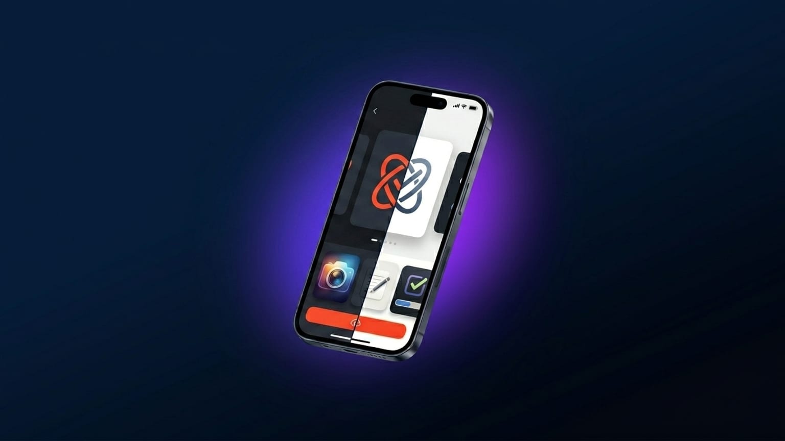
The "both modes" anti-pattern
Showing dark mode in some panels and light mode in others (often paired with a "supports both modes!" caption on one panel) doesn't help. It looks like the designer couldn't pick. The carousel as a whole should commit to one palette family; the fact that the app supports both modes is communicated by the App Store metadata, not the screenshots.