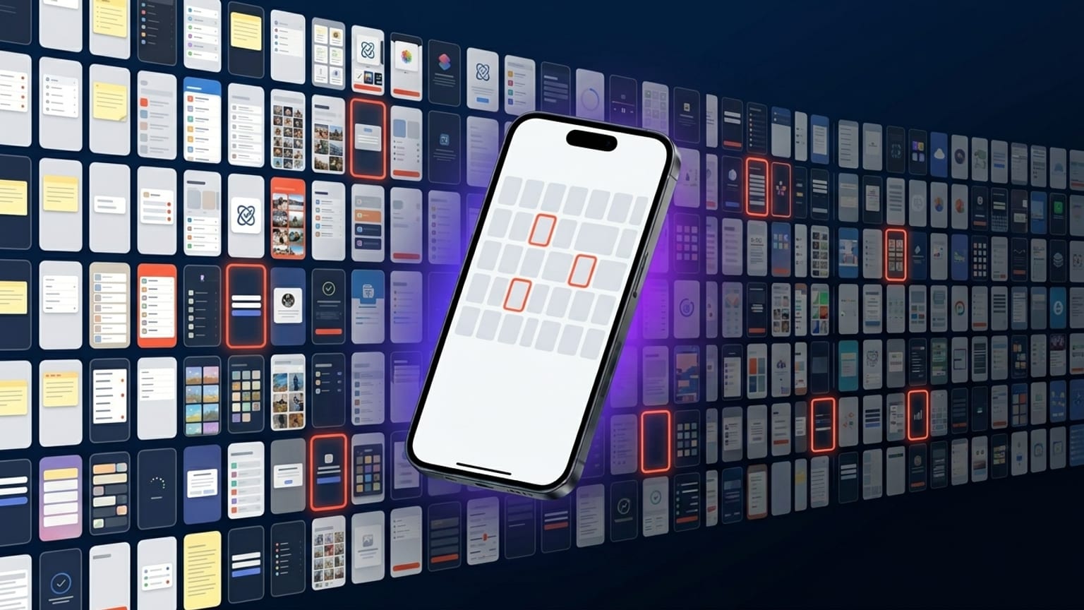
App Store screenshot statistics from the top 100 apps
Caveat upfront: this isn't a controlled study. It's pattern-spotting from a few hundred top-ranked App Store screenshots across categories, manually inspected over the last few months. The observations below are what we keep seeing, not statistical claims. Where percentages appear, treat them as "directional" rather than precise.
Plenty of ASO research firms (Phiture, AppTweak, Adapty, Mobile Action) publish their own analyses with real sample sizes and methodology — those are the canonical references if you need defensible numbers. This post is the patterns we keep arriving at independently.
Caption length
Sample of ~200 panel-captions across Finance, Health, Productivity, Travel, and Entertainment categories on the US App Store top-100: average caption length lands around 6-9 words. The long tail goes up to ~15 words but those are rare and they almost always wrap unpredictably at thumbnail size.
Three caption-length archetypes we see consistently:
- 3-word captions — punchy, single-claim. "Track every meal." "All your money." Reads like a tagline.
- 6-9 word captions — the common middle. "Your money, all in one view." "Read more, save more, never lose a tab."
- Two-line stacked captions — first line big, second line smaller. Often a benefit + clarification. Shows up most in Productivity and Tools categories.
What we don't see much of: caption-as-sentence ("Manage your investments with our easy-to-use dashboard"). It reads as ad copy, not product copy.
Device tilt
In categories that lean visual (Entertainment, Photography, Health, Fitness, Social), ~70% of top-100 carousels feature tilted devices. The remaining ~30% use upright (no tilt) devices.
In utility categories (Finance, Banking, Productivity, Tools), the split is closer to 50/50. Utility apps lean upright when they're trying to signal "serious, professional", tilted when they're trying to signal "modern, fresh".
Of tilted carousels, the majority use the same tilt direction across all panels — not alternating. This is the strongest individual pattern we noticed: alternating tilt was clearly the 2022-2023 default and is now a minority choice.
Dark mode vs light mode
Roughly 50/50 across categories with some category-specific lean:
- Lean dark: Games, Photo/Video tools, Health/Fitness, Music, AI
- Lean light: Productivity, Tools, Education, Kids
- Mixed: Finance, Social, Travel
The 2022-2023 advice "dark always wins" came from real A/B test data, but most of that data was from categories that were already lean-dark naturally (games, music, photo). When you control for category, the dark-mode advantage shrinks to within noise. Pick the mode that fits your brand.
Background pattern
Three pattern-categories dominate:
- Gradient background (linear or radial, two-color) — the most common.
- Solid color background — used by minimalist brands. Less common but growing.
- Photo background — common in Travel, Food, Lifestyle. Rare elsewhere.
Pattern fills (stripes, dots, grid, checkers) are vanishingly rare on top-100 carousels. They show up on smaller apps, often look amateur, and rarely scale to thumbnail size legibly. This was less true in 2021-2022 when pattern fills were trendy in design generally.
Continuity across panels
Roughly 60-70% of top-100 carousels have visual continuity across panels — gradient that flows, shared anchor positions, consistent caption format. The remaining 30-40% treat each panel as an independent screenshot.
The continuity carousels tend to be from established brands with design teams (Apple's own apps, Notion, Linear, Things, Robinhood, Headspace). The independent-panel carousels tend to be from smaller teams or older apps that haven't redesigned since 2020.
We don't have install data per carousel, so we can't claim continuity converts better — only that the apps that are demonstrably succeeding at App Store distribution lean toward it.
Caption position
~85% of captions sit in the top quarter or top third of the panel. The remaining ~15% are split between bottom-quarter and mid-panel positioning, both of which are usually paired with a device that occupies the top half.
Captions in the exact middle of a panel — overlapping the device — are vanishingly rare on top-100 carousels. They make the panel feel busy and the caption hard to read at thumbnail size.
Number of panels
The mode is 5 panels. The full 10-panel max is uncommon (~5% of top-100), and almost always comes from apps with lots of distinct features that map to distinct screens (note-taking apps showing different views, productivity apps showing different modules).
3-panel carousels are also rare (~10%). The remaining ~85% sit at 4 or 5 panels. This is the practical sweet spot: enough to tell a story, not so many that users tap out.
What's category-conventional
Specific color associations we see consistently:
- Finance: deep blue, sometimes green. Almost never red (avoiding loss signaling).
- Health/Fitness: teal, soft green, occasionally pink for women-focused apps.
- Productivity: orange or yellow accents, often on white/light backgrounds. Black-and-white minimal also common.
- Entertainment: bold warm palettes, deep purple, magenta, gradient saturation.
- Travel: photo backgrounds, often turquoise/orange combinations.
- AI: warm beige/orange (Claude AI), or dark with neon accents (most chatbot apps).
Breaking these conventions is risky for new apps trying to compete with established players in the category. Established apps with brand equity can afford to break convention; new apps usually benefit from matching it.
What this means for your carousel
If you're shipping a new App Store carousel in 2026, the patterns above suggest:
- 6-9 word captions, top-quarter position.
- 4 or 5 panels.
- Tilt the device (10-15°) in the same direction across the carousel.
- Pick category-conventional palette unless you have brand equity to spend.
- Continuous gradient background across panels.
This is descriptive, not prescriptive. If the apps that are winning the category right now do X, and you're trying to enter the category, doing not-X is an experiment with a real downside.