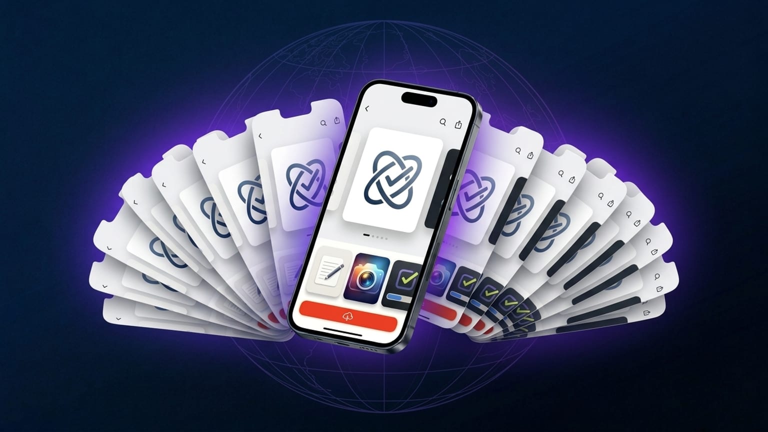
Localizing App Store screenshots into all 39 languages
Apple's App Store accepts screenshots in 39 localizations. Most app teams ship in 3-5 because the manual workflow doesn't scale: translate captions to 5 languages, re-export 5 versions, upload 5 times per device class. The grind is real. The question is whether it's worth automating away, and the answer in 2026 is yes — the conversion data on localized creative has improved enough that the automation pays for itself.
What the published numbers look like
Phiture, AppTweak, Adapty and Mobile Action each publish individual case studies showing localized creative lifting tap-to-install in specific markets — the magnitude varies widely depending on category, market, and how baseline-undermarket the original English creative was. Read their published case studies for the specifics; we'd rather not flatten that into a single percentage that would be wrong for most apps. The directional consensus across all of them: non-English markets reward localization more than English markets reward additional optimization, and Japanese, Korean, German, and Brazilian Portuguese are the markets where the lift is most consistently meaningful.
Concretely: a finance app with 100k US installs/month and 30k Japanese installs/month often sees a higher absolute install lift from localizing JP screenshots than from running A/B tests on the US carousel. The Japanese market is smaller in volume but the lift percentage on a smaller baseline is often larger.
The 39-locale list
Apple's full submission list, organized by region:
- English variants: en-US, en-GB, en-AU, en-CA
- European Latin-script: de-DE, fr-FR, fr-CA, es-ES, es-MX, it, pt-PT, pt-BR, nl-NL, sv, no, da, fi, hu, cs, sk, hr, ro, pl, el, tr, ca
- Cyrillic: ru, uk
- Right-to-left: ar-SA, he
- South + Southeast Asia: hi, th, vi, id, ms
- East Asia: ja, ko, zh-Hans, zh-Hant
Most apps don't need all 39. The pragmatic question is which subset.
How to prioritize
Honest tiers:
- Hand-review (3-5 locales): your home market plus your top 2-4 non-English markets by install volume. For most global apps that's en-US, ja, de-DE, pt-BR, and one of es-ES / es-MX / fr-FR / ko depending on traction. These get a native speaker to read every caption.
- Auto-translate with smoke-test (10-15 locales): the next tier of markets where you have meaningful installs. AI translation gets you 80% of the way; switching the active language in the editor and reading each caption catches the obvious mistranslations and weird tone.
- Auto-translate only (any remaining markets you care about): minimal review. Ship and watch the analytics.
- Skip: locales where you have no installs and no plans to market. Apple falls back to your default locale for any uncovered language — that's fine.
The "skip" tier matters. A bad translation in a market you don't care about is worse than no translation: users in that market see broken Japanese (or broken Polish, or broken Arabic) and bounce. The fallback to English is at least readable.
Where machine translation breaks
Auto-translate is competent but not perfect for App Store creative. Things to always hand-fix:
- Brand names, product names, feature names. "Inbox Zero" gets translated literally to compound nouns in many locales. Lock these in source language.
- CTA imperatives. "Tap to start" defaults to formal-imperative in Japanese, which is wrong for app UI. Use the casual/imperative form natives use in apps.
- Plural forms. "3 tasks" works in English; Polish, Russian, Arabic have multiple plural forms depending on the count.
- Gender. German, French, Spanish, Italian guess gender. Default guess is often masculine; if your audience is mixed or female-leaning, hand-fix.
Visual blowup per locale
Same caption renders at very different widths across languages. Specifically:
- German, Russian, Ukrainian, Hungarian, Finnish: +30-50% width. Captions overflow the safe area.
- French, Italian, Spanish, Portuguese: +10-20%.
- Chinese (both variants), Japanese, Korean: -30-50%. Captions look sparse.
- Thai: no word separators — line-breaks happen at character boundaries.
- Arabic, Hebrew: right-to-left flow. Text alignment flips; device frames stay.
Don't fix this with a global font-size shrink. The carousel should look balanced per locale, not balanced across all locales simultaneously. The editor lets you override font size per locale; use that for the worst-blowup languages (German is the most common offender).
Font support
Most marketing fonts cover Latin, Cyrillic, Greek, and Vietnamese. They don't cover Arabic, Hebrew, Hindi (Devanagari), Thai, or CJK (Chinese, Japanese, Korean). For those locales the font falls back to system-default, which usually looks fine but inconsistent with your Latin-script branding.
Two reasonable answers:
- Accept the font-fallback per locale. Most users in non-Latin-script markets are used to system-default and don't notice.
- Use multi-script fonts like Noto, Inter Display + Inter Hindi/Arabic supplements, or system-stack alternatives that match. Adds complexity but maintains brand.
The 1-hour workflow
Realistic time budget for localizing a 5-panel carousel across all 39 App Store locales, using Screenshotify:
- 5 min: enable the locales you want, click "Translate all", auto-translate runs.
- 15 min: hand-review your top 3-5 markets in the language switcher. Edit each caption inline. Per-locale edits stick.
- 15 min: smoke-test the next 10-15 markets. Skim each in the switcher, fix obvious mistranslations.
- 15 min: visual review — find the locales where captions overflow or look sparse, override font size for those.
- 5 min: click export, get one ZIP organized by locale, upload to App Store Connect.
About an hour of focused work versus the day-or-more it used to take when you hand-translated and re-exported per locale. The economics of localization shifted.